"I thought that CD cover looked familiar..."
I was browsing for news on digg I came across a story about Times New Roman not being included in the beta for Microsoft Office 2007. I had never seen fadtastic, the site the article was on. While browsing the site I found another article talking about the cover of Franz Ferdinand's You Could Have It So Much Better.But this way of doing it, the whole birth of industrial design education, graphic design, advertising, photomontage and photography as we know it, was done by experiment and put to the test by some great people of the early 20th century, the pioneers of graphic design. Marinetti (The futurists, Italy), Alexander Rodchenko, Laszlo Moholy-Nagy. Their influences are still remarkably visible in todays graphic and webdesign despite the digital age bringing new production techniques.
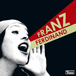
The cover of You Could Have It So Much Better by Franz Ferdinand (2005) in the style of Russian avant garde was influenced by this 1924 portrait of Lilya Brik by Alexander Rodchenko.
http://fadtastic.net/2006/04/22/the-heroic-years-of-graphic-design/
It occurred to me moments later that it wasn't Rodchenko's portrait that looked so familiar, but the opening for Attack of The Show.
 It's a style I've always wanted to use, but I don't have any real education in art, so trying to employ and styles other than ones I'm already familiar with is rather difficult and the results are somewhat unsatisfactory. From what I've seen on the WikiPedia entry for Attack of The Show they've changed their logo, and possibly their opening video. I don't actually watch the show more than once every few months, since I still hold a grudge against G4 for eating TechTV.
So this industrial style is something I want to peruse, but I need to get some actual art training (or just read lots of WikiPedia entries) before I can start making good use of it.
Posted by XenoFreq @ 8:58 PM


0 Comments:
Post a Comment
<< Home