Wednesday, October 25, 2006
No Updates? Gasp!
I'm not in school right now. I don't even know if I want to continue studying to be a designer. I'm trying to sort things out.

I have been doing some art stuff, but not much. I recreated
an image my friend made to give it some more life.
That's all for the updates. Look forward for more sometime before... well, before the internet is replaced with... something...
Posted by XenoFreq @ 7:58 PM
-


Thursday, July 06, 2006
Points VS Picas
Okay, time for me to vent. I only feel the need to vent in one class; surely that's not healthy. Something is drasticly wrong with this environment.
So in class right now we're working on this travel brochure. It's another project to make an exact clone of something that's already been made. The first step is to setup the page, which is no big deal. Then it says to have the top and bottom margins set to 18pt and the left and right margins to be at 1p6. Um... they're the same thing? Okay, sure, whatever, let's continue. Next step? Go into the the prefrences and change the vertical ruler to points and the horizontal ruler to picas.
What?! Why? They're the same measure system. You wouldn't have the rulers set to decimal inches and fraction inches, would you? No! Why do it with points and picas?
We have a sub. while our normal teacher is out of town. She's not actually a teacher, but she's from the industry, so she actually knows her stuff. I actually enjoy hearing her talk about different events that happened in the industry and problems that she's had to try and figure out due to software issues and having to deal with other people's workflows.
On another negative note a new student took the computer I used all last quarter and claimed it has her own. Now there's no reason it should be mine and mine alone since all our files are erased, but the computer that I'm using now doesn't recognize the keypad and once in a while decides that clicking on things with the mouse should produce no effect. So it's a little fustrating. It's probably a problem that's fixed in one of the patches for OS 10.4, but my teachers don't download the patches (there's 149MB of patches for the OS alone, and more for other iLife programs).
Posted by XenoFreq @ 1:21 PM
-
Monday, June 19, 2006
No Updates
I go to a technical college, and thus the rules for summer break are not the same as a 4-year college or university. I only get one week off, and I shall enjoy my break as much as possible. I don't plan on doing any designing, I don't plan on drawing, or anything relating to art. So I won't have any updates until at least Monday.
See you 4th quarter.
Posted by XenoFreq @ 11:13 PM
-
Monday, June 12, 2006
Realism
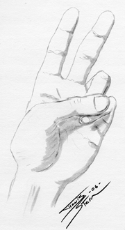
It's been a long time since I've drawn anything that looked not awful, and today's drawing was inspired by pure boredom. There are some other drawings of my left hand that I did throughout the day, including one pushing a red button; It's my personal favorite, which I'll upload later. The thumbnail links to a 6MB TIFF, so if you're on dial-up you might want to get a snack or something. I used a pencil for the drawing part and a light-gray brush-pen to do the shading.
Posted by XenoFreq @ 2:41 PM
-
Wednesday, June 07, 2006
The Death of XenoBlog?
Maybe. Even then, only in name. The name XenoBlog doesn't really describe anything, it doesn't decribe me, and it doesn't exactly flow off the tongue. Even worse, the domain name XenoBlog.com is already taken. So I think it's time for a name change, as well as a purpose change. So here's what I'm planning on doing. I'm going to change the blog into a portfolio
slash blog, so I can put my art on part of it, and rants and news about design on the other. Or together, who knows. I'm rather limited with what I can do with Blogger, and until I get my own server again I can't use Movable Type or similar software.
So what's the name?
I was considering Zubutoi Designs. The Japanese thing may be a little cliche, but I don't care. I've actually taken the time to study the language and the culture, so I'll actually know what I'm doing. The kanji for "Zubutoi" conveys exactly what it means: "Bold".
So I'm going to work on more sketches and stuff. Once I get the new site up and running I'll probably post concept sketches, too.
Posted by XenoFreq @ 8:49 PM
-
Paper Zone Is Going Out of Business

So I stopped by
Paper Zone for some
vellum and I saw a sign in the window. It read "Closing sale. 40% off everything." Well jeez, you can't argue with nearly half-off. I ended up spending about $60 on $100 worth of paper and supplies, though not all of it was for me. I got some awesome vellum in white, blue, and orange, as well as a sheet of UV paper, though I don't know what it is. It's cool looking, though, and that's what matters. I also got some large sheets of patterned paper, which I'm currently using as wallpaper behind my computer. I'm not exactly sure what I'm going to do with most of it, but I'm planning on printing on some for a portfolio, which should give it a really awesome look that should stand out some.
I've started sketching out some ideas for new layouts and graphics. I've got some good ideas, but I'm not going to publish anything until I can get something I wouldn't mind seeing XenoBlog in.
I've also been looking into getting a domain name. XenoBlog.com is already taken (and active), so I'll have to think of something else.
Posted by XenoFreq @ 4:45 PM
-
Saturday, June 03, 2006
XenoBlog Redesign
I have a problem. I love the way XenoBlog looks, and I love the colours, layout, everything. What's the problem? Leaving it alone and simply being satisfied with my past work prevents me from progressing in my ability as a designer. I've been looking at styles of design from the '30s and '40s and I really would like to emulate their style, while making it somewhat modern.
I feel pretty awful about this, actually, because even though I don't study the artistic side of design where I'm going to school I did take that in high school from my favorite teacher for a year. And now I've forgotten most of what I had learned. Even worse, the school had issues with how much storage they had on their servers and deleted all of my class' work. When I went there they saved them for a little over a year, then they saved it to a CD for archive incase the students wanted/needed their data, but I'm ranting now. The point is that I need to re-learn the graphic side of graphic design. This is both good and bad, because I have to learn it all over again, but it should vastly improve my design skills, too.
I was browsing for some new graphic design blogs to read I stumbled across
gusmayo.com, which doesn't have any content on it, but it has a nice display of, what I assume to be, CSS layouts. There's nothing old about the design of it, and I love the way it looks. So now I'm torn between an old design style and a modern one. Maybe I should combine the two, but oh man, that'd be quite an undertaking.
While I was browsing through my computer to see if I still had a specific layout I used when I had my own server and ran
Movable Type 3, and I came across an splash image that was just
abstract metalic-ish blue and gold on a black background. I don't know that it has any ties to specific art styles or eras, but there's something about it that captures my attention. I don't know if I should use its style for a layout because it's so bold, but I feel that leaving it on my hard drive to 'collect dust' is a waste of powerful (to me) art.
I would like to make a comment reguarding my
previous post about Times New Roman not being in the Office 2007 beta. I was wrong. It is included, but the is no longer the default faunt. I feel like an idiot, now.
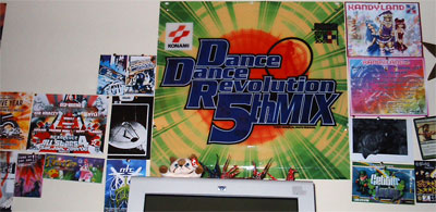
Anyway, that concludes this post. I was going to do a post about the film and colour keys I had made in class, but I need light tables and the like before I can get pictures that do them justice. So I'll leave you (as though I have any readers), with this. It's the wall behind my computer where I put my collection of rave flyers and other graphics I've collected from things I enjoy.
Posted by XenoFreq @ 7:24 PM
-
Saturday, May 27, 2006
"I thought that CD cover looked familiar..."
I was browsing for news on
digg I came across a story about
Times New Roman not being included in the beta for Microsoft Office 2007. I had never seen
fadtastic, the site the article was on. While browsing the site I found another article talking about the cover of Franz Ferdinand's
You Could Have It So Much Better.
But this way of doing it, the whole birth of industrial design education, graphic design, advertising, photomontage and photography as we know it, was done by experiment and put to the test by some great people of the early 20th century, the pioneers of graphic design. Marinetti (The futurists, Italy), Alexander Rodchenko, Laszlo Moholy-Nagy. Their influences are still remarkably visible in todays graphic and webdesign despite the digital age bringing new production techniques.
The cover of You Could Have It So Much Better by Franz Ferdinand (2005) in the style of Russian avant garde was influenced by this 1924 portrait of Lilya Brik by Alexander Rodchenko.
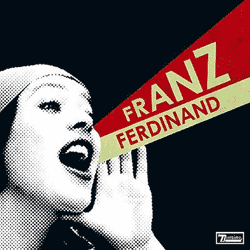
http://fadtastic.net/2006/04/22/the-heroic-years-of-graphic-design/
It occurred to me moments later that it wasn't Rodchenko's portrait that looked so familiar, but the opening for
Attack of The Show.

It's a style I've always wanted to use, but I don't have any real education in art, so trying to employ and styles other than ones I'm already familiar with is rather difficult and the results are somewhat unsatisfactory. From what I've seen on the
WikiPedia entry for Attack of The Show they've changed their logo, and possibly their opening video. I don't actually watch the show more than once every few months, since I still hold a grudge against G4 for eating TechTV.
So this industrial style is something I want to peruse, but I need to get some actual art training (or just read lots of WikiPedia entries) before I can start making good use of it.
Posted by XenoFreq @ 8:58 PM
-


