XenoBlog Redesign
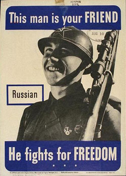
I have a problem. I love the way XenoBlog looks, and I love the colours, layout, everything. What's the problem? Leaving it alone and simply being satisfied with my past work prevents me from progressing in my ability as a designer. I've been looking at styles of design from the '30s and '40s and I really would like to emulate their style, while making it somewhat modern. I feel pretty awful about this, actually, because even though I don't study the artistic side of design where I'm going to school I did take that in high school from my favorite teacher for a year. And now I've forgotten most of what I had learned. Even worse, the school had issues with how much storage they had on their servers and deleted all of my class' work. When I went there they saved them for a little over a year, then they saved it to a CD for archive incase the students wanted/needed their data, but I'm ranting now. The point is that I need to re-learn the graphic side of graphic design. This is both good and bad, because I have to learn it all over again, but it should vastly improve my design skills, too.
I was browsing for some new graphic design blogs to read I stumbled across gusmayo.com, which doesn't have any content on it, but it has a nice display of, what I assume to be, CSS layouts. There's nothing old about the design of it, and I love the way it looks. So now I'm torn between an old design style and a modern one. Maybe I should combine the two, but oh man, that'd be quite an undertaking.
While I was browsing through my computer to see if I still had a specific layout I used when I had my own server and ran Movable Type 3, and I came across an splash image that was just abstract metalic-ish blue and gold on a black background. I don't know that it has any ties to specific art styles or eras, but there's something about it that captures my attention. I don't know if I should use its style for a layout because it's so bold, but I feel that leaving it on my hard drive to 'collect dust' is a waste of powerful (to me) art.
I would like to make a comment reguarding my previous post about Times New Roman not being in the Office 2007 beta. I was wrong. It is included, but the is no longer the default faunt. I feel like an idiot, now.
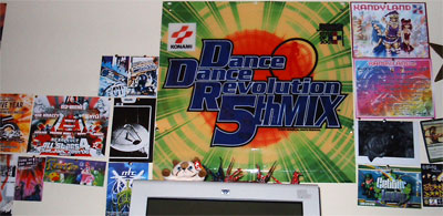
Anyway, that concludes this post. I was going to do a post about the film and colour keys I had made in class, but I need light tables and the like before I can get pictures that do them justice. So I'll leave you (as though I have any readers), with this. It's the wall behind my computer where I put my collection of rave flyers and other graphics I've collected from things I enjoy.

Posted by XenoFreq @ 7:24 PM


0 Comments:
Post a Comment
<< Home